March 18, 2026
Published on RubyStackNews
One of the most useful tools in exploratory data analysis is the 2D histogram. Not the bar chart kind — the density map kind. Given a cloud of points, it answers a simple question: where do most of them live?
This article shows how to build one from scratch in pure Ruby using ruby-libgd, replicating a classic matplotlib example — and then taking it further with real CSV data.
What is a 2D histogram?
A regular histogram divides one variable into bins and counts how many values fall in each bin. A 2D histogram does the same thing for two variables simultaneously.
The result is a grid. Each cell covers a small region of the (x, y) plane, and its color represents how many data points landed there — light for few, dark for many.
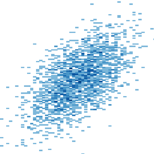
It is particularly useful when you have thousands of points and a scatter plot would just look like a solid blob. The density map reveals structure that raw scatter hides: clusters, correlations, gaps, and outliers all become visible at a glance.
The matplotlib original
import matplotlib.pyplot as pltimport numpy as npnp.random.seed(1)x = np.random.randn(5000)y = 1.2 * x + np.random.randn(5000) / 3fig, ax = plt.subplots()ax.hist2d(x, y, bins=(np.arange(-3, 3, 0.1), np.arange(-3, 3, 0.1)))ax.set(xlim=(-2, 2), ylim=(-3, 3))plt.show()
Three lines of actual work: generate data, call hist2d, set limits. The challenge in Ruby is that none of those three things exist as builtins. We need to build each one — and design a class that works beyond just this one example.
Design decision — the class receives data, it does not generate it
The first version I wrote hardcoded the data generation inside the class. That was wrong. A visualization class should be a renderer, not a data generator.
The correct interface matches how matplotlib works — you pass the data in:
Hist2D.new(x: x_array, y: y_array).render("hist2d.png")
This means the class works equally well with synthetic data, CSV files, database queries, or API responses. The renderer does not care where the numbers came from.
Building it in Ruby
Step 1 — Normal random data
Python’s np.random.randn generates numbers from a standard normal distribution. Ruby’s Random only generates uniform values between 0 and 1.
The solution is the Box-Muller transform — a mathematical identity that converts two uniform random numbers into one normally distributed value:
def randn(rng) u1 = rng.rand; u2 = rng.rand u1 = 1e-10 if u1.zero? # guard against log(0) Math.sqrt(-2.0 * Math.log(u1)) * Math.cos(2 * Math::PI * u2)endrng = Random.new(1)x_data = 5000.times.map { randn(rng) }y_data = x_data.map { |xi| 1.2 * xi + randn(rng) / 3.0 }
Step 2 — Bin the data
We divide the plane into 0.1-wide cells from -3 to 3, giving a 60×60 grid. For each point we find which cell it belongs to and increment a counter:
counts = Array.new(nb) { Array.new(nb, 0) }x_data.zip(y_data).each do |x, y| xi = bin_index(x, bins) yi = bin_index(y, bins) next if xi.nil? || yi.nil? counts[xi][yi] += 1end
Step 3 — Color and draw
Each non-empty cell becomes a colored rectangle on the canvas. The color is mapped through a blue gradient — white for sparse, deep blue for dense.
A gamma correction (** 0.4) spreads the color range so low-density areas remain visible instead of washing out to white:
t = (count.to_f / max_count) ** 0.4color = colormap(t)img.filled_rectangle(px0, py0, px1, py1, GD::Color.rgb(*color))
Result — synthetic data
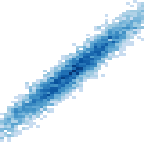
The diagonal band shows the linear correlation y = 1.2x. The dense dark-blue center is where most of the 5000 points concentrated. The lighter fringe shows the spread from the noise term.
Going further — real CSV data
Because the class receives data as arrays, swapping to a CSV file requires no changes to Hist2D at all:
ruby
require 'csv'rows = CSV.read("weather.csv", headers: true)x_data = rows["temperature"].map(&:to_f)y_data = rows["humidity"].map(&:to_f)Hist2D.new( x: x_data, y: y_data, bin_step: 0.5).render("weather_hist2d.png")
The sample CSV contains 2000 rows of correlated weather measurements — temperature (°C) and humidity (%) from a simulated tropical climate. Humidity tends to rise with temperature, so the 2D histogram reveals the same diagonal structure but with a different shape and spread.
The full workflow in Jupyter
Three cells:
# Cell 1 — define Hist2D class# Cell 2 — generate weather.csvrequire 'csv'# ... Box-Muller + CSV.open (see notebook)# Cell 3 — load and plotrows = CSV.read("weather.csv", headers: true)x_data = rows["temperature"].map(&:to_f)y_data = rows["humidity"].map(&:to_f)Hist2D.new(x: x_data, y: y_data, bin_step: 0.5).render("weather_hist2d.png")display("weather_hist2d.png")
Jupyter makes this workflow natural — generate the data in one cell, render in the next, tweak bin_step and re-run. The same iterative loop that made Python notebooks popular for data exploration works just as well in Ruby.
What comes next
A 2D histogram is one of the simpler statistical visualizations — but it establishes the pattern that applies to everything more complex: bin the data, count, normalize, colormap, draw.
The same approach works for heatmaps, kernel density estimates, and hexbin plots. Those are the next steps on the road to a complete Ruby data visualization toolkit.
Languages evolve when their communities push boundaries. This is one more small push.
→ Jupyter notebook: https://github.com/ggerman/ruby-libgd/tree/main/examples/jupyter-notebooks → ruby-libgd gem: https://rubygems.org/gems/ruby-libgd → Documentation: https://ggerman.github.io/ruby-libgd/en/index.html
German Silva — @ruby_stack_news